Visual Studio 2026 Product Icon Refresh
Client:
Microsoft, Visual Studio
Role:
Designer
Challenge:
The challenge was to evolve the Visual Studio launch icon in a way that meaningfully reflected the product’s growth. It needed to stand apart from previous and current taskbar icons while aligning with Microsoft’s updated product icon system, including its visual style and color guidance.
Solution:
The approved Visual Studio icon preserves its recognizable infinity symbol while refreshing its visual treatment to align with Microsoft’s product icon system.
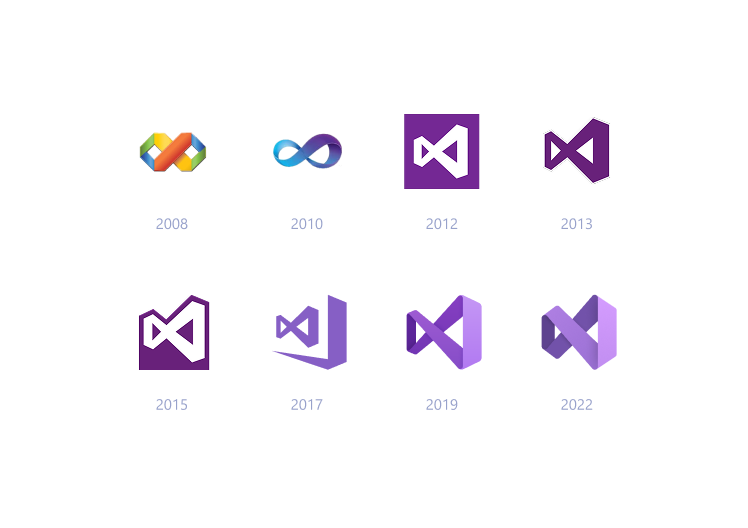
Past and current Visual Studio product launch icons
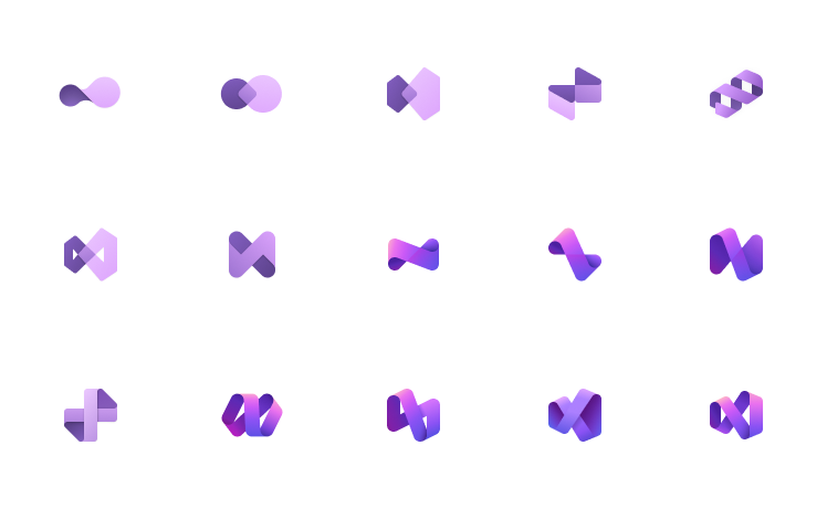
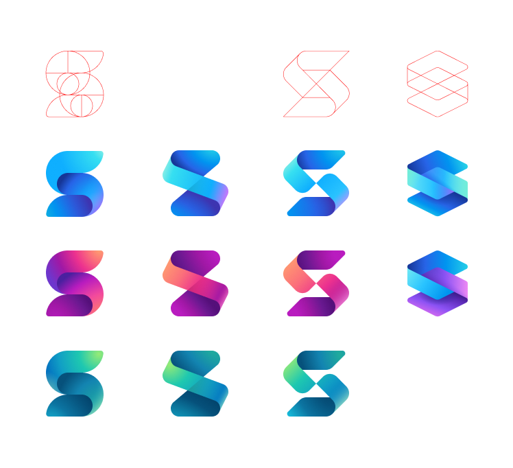
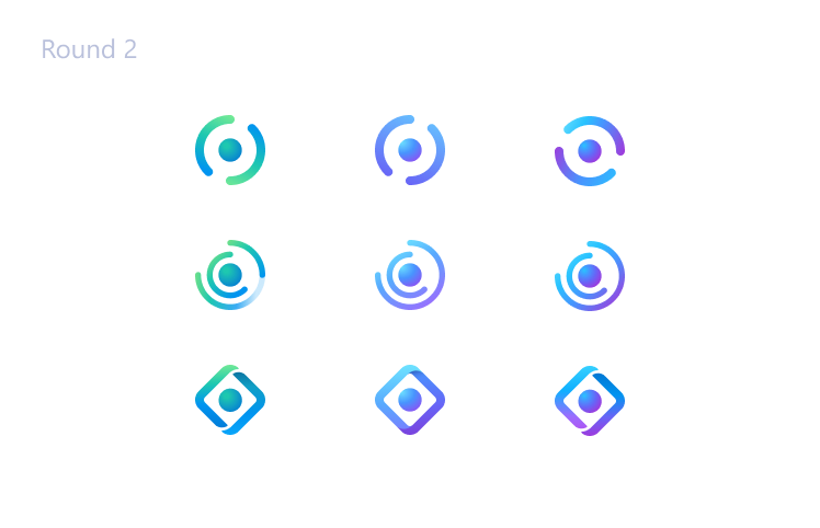
Initial explorations, playing with the infinity sybmol
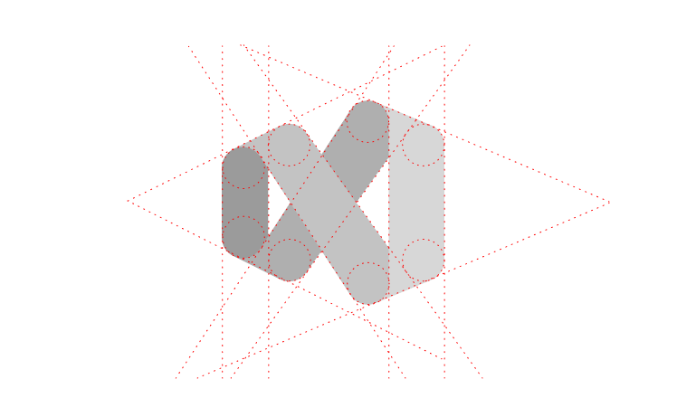
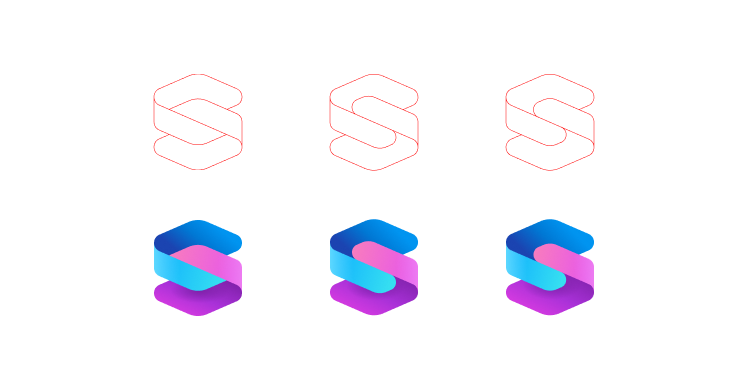
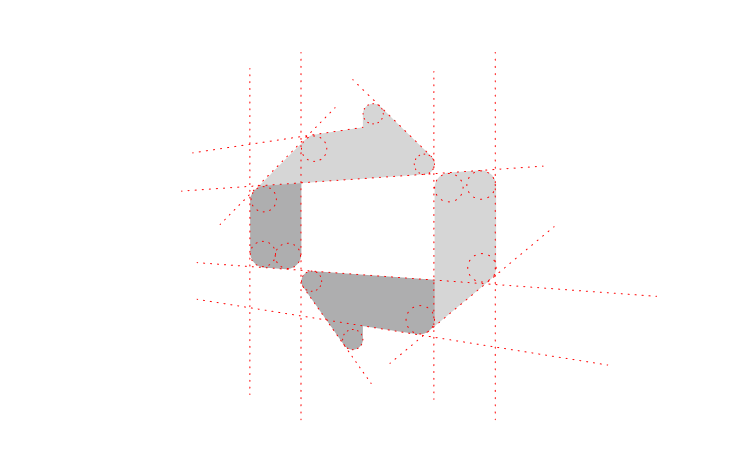
The construction of the refreshed product icon
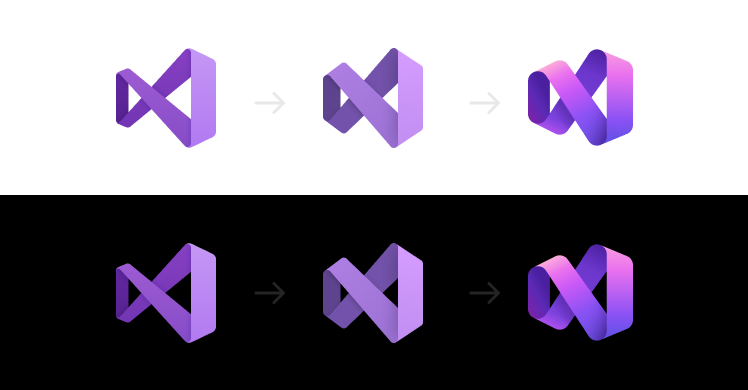
Visual Studio product icons: comparison and evolution
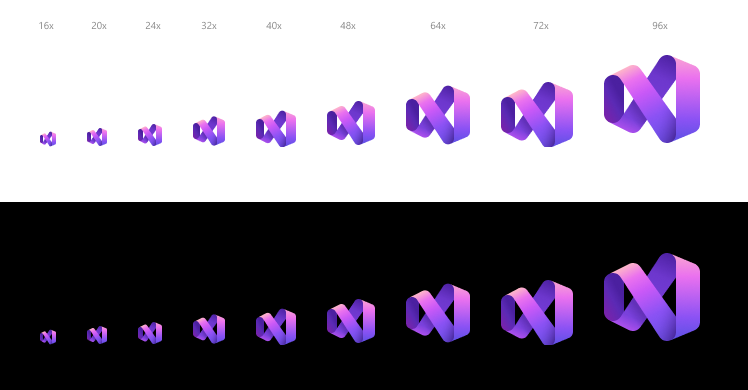
Visual Studio scale ramp for various UI size requirements
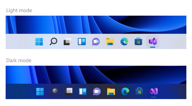
Windows taskbar content screens
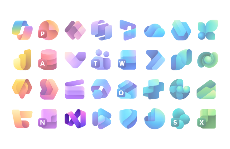
Refreshed Visual Studio icon shown alongside some of Microsoft’s product icons to highlight its visual alignment.
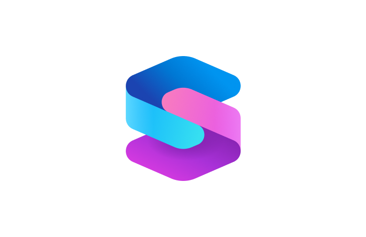
The released Visual Studio 2026 product icon.
Client:
Microsoft, Windows
Role:
Illustrator, Production
Challenge:
In collaboration with Microsoft Design Group and Portland-based studio Always with Honor, I helped create more than 450 emojis for Windows 10. We established a bright, expressive geometric style and a pixel-precise design system that met Microsoft’s display requirements and remained legible at small sizes. A bold black outline helped each emoji stand out against any background.
After the initial release, our internal team extended the emoji library in line with new candidates approved by the Unicode Consortium. We created hundreds of designs, refining each through multiple rounds of review and approval, then prepared the final artwork for color-font production.
Solution:
Once the visual style was established, I designed hundreds of emojis in Illustrator, maintaining consistency and attention to detail. After approval, I prepared each design as a layered, font-ready file, organizing artwork by color and refining shapes for legibility at smaller sizes.
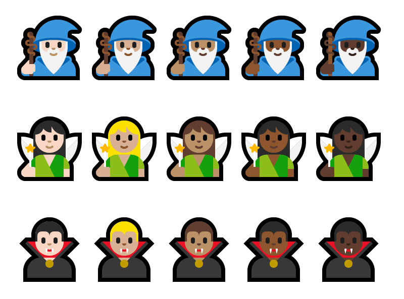
Example of some of the many colorful emojis I created for Microsoft
Each emoji requires a black and white version called a fallback. When a display system encounters a character that is not part of the repertoire of any of the other available fonts, a symbol from a fallback font is used instead.
Emoji I created using pure geometry. Each emoji is snapped to grid to insure pixel perfection when rendered at smaller sizes.
I performed final production on all approved Emoji. This involved creating individual Illustrator files with separated color layers for final font production
Example of comp sheets used to explore various design iterations.
Included in this emoji redesign is the addition of skin tone modifiers based on the Fitzpatrick scale, a numerical model developed by dermatologist Dr. Fitzpatrick in 1975. These modifiers can be applied to any of the human or hand gesture emojis.
A small sample from hundreds of emojis I conceptualized, designed, and produced.
Emojis incorporated in Microsoft’s Touch keyboard
Client:
Microsoft Office
Role:
Visual Designer
Challenge:
Visually refresh Microsoft’s Office Application Icons to reflect an evolution of significant product changes. With this icon redesign we faced two big challenges. We needed to signal innovation and change while maintaining a familiarity for Office’s 1 billion+ customers.
Solution:
I Partnered with multiple product teams and stakeholders to create a comprehensive design solution for each Office application icon. Simplicity and harmony were key visual elements when creating each Office app. We incorporated an updated color palette choosing hues that are bolder, lighter and friendlier. While each app icon has a unique symbol representing the app’s core functionality, the system is tied together by a set of guidelines which creates harmony across the collective suite.
The top row represents the legacy versions of the Office applications icons. The second row shows the refreshed monochromatic design updates. The third row shows the full color redesigned app icons.
Optimized size ramps of each of the Office application icons.
Examples of some initial explorations.
Context Screen: www.Office.com
Context Screen: Microsoft Store
Context Screen: Office Apps displayed on multiple devices
Client:
Microsoft, Windows
Role:
Designer, Production
Challenge:
With the release of Windows 10 the Windows Design Group (WDG) wanted to visually refresh all the operating system’s File Explorer Icons. The first challenge was to perform a thorough icon audit of all the File Explorer icons that were actively being used by the operating system. The second challenge was to create a system of icons with a refreshed look while maintaining some cohesion and familiarity to the legacy set of icons. Extensive explorations including line weight, color palette, color application, angles, light source, and size requirement for high dpi displays.
Solution:
Once the style was established and tested by our team I designed hundreds of desktop styled icons for Windows 10 File Explorer.
The top row represents a sample of Vista icons that required a visual refresh for the release of Windows 10. The second row shows a first pass based on Basel (metro) style. This direction proved to be too far removed from the Vista icons user’s were familiar with. The bottom row represent the approved direction.
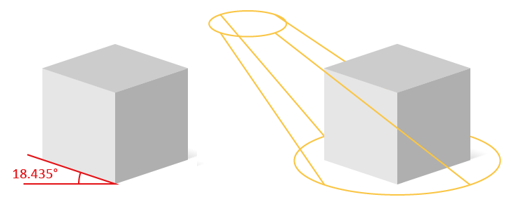
Uniform angles and light source were implement for all 3 dimensional icons
Hololens image I created using Illustrator
Optimized size ramp of the Hololens icon
Windows File Explorer icons I designed maintaining a consistent dimetric perspective
Flat Windows File Explorer icons I designed
Successful Windows 10 File Explorer icon implementation
Client:
Microsoft, Windows
Role:
Designer, Production, System Maintenance
Challenge:
With the release of Windows 10, Microsoft wanted to replace Windows 8/8.1 Segoe UI Symbol icon font with Segoe MDL2 Assets font. The challenge was to create an updated style of glyph assets (or icons) with a consistent line weight, placement and consistent usage of preestablished metaphors.
Solution:
Once a style was established our design team created a library of common-elements used to maintain consistency between thousands of icons we’ve since created. Segoe MDL2 Assets font icons are constantly being added and are now successfully implemented in the Windows 10 OS.
MDL2 icons are drawn using pure geometry
Angles are optimized to read well at smaller sizes
A comp sheet I created to show variations for the concept of ‘music visualization’
Common elements used to create the thousands of MDL2 icons that exist
MDL2 color and style explorations
Client:
Microsoft, Windows
Role:
Visual Designer
Challenge:
With the release of Windows 8 Microsoft wanted to visually refresh some of it’s existing icons and added additional icon to the operating system. Extensive explorations including line weight, color palette, color application, angles, light source, and size requirement for high dpi displays were performed.
Solution:
Once the style was established I designed hundreds of icons for application such as Mail using Photoshop paths and various layer effects as defined by the style guidelines. Once the icons were approved, I created 6 additional sizes to satisfy high dpi requirements.
Comp sheet created to conceptualize the metaphor, “What’s New.” Requirement: icons needed to work on multiple colored backgrounds
Close up of megaphone designed with Photoshop paths
Cloud concept explorations
Apple laptop icon size ramp
One of the main comp sheets I create for the Mail Application icons. Each icon required 7 optimized sizes for high plateau requirements
Icons incorporated into the Windows 7 Mail Application
Client:
Microsoft, Windows
Role:
Visual Designer
Challenge:
With the release of Windows 10, Microsoft wanted to create a series of tips for its Tips application to help users navigate Windows. The challenge was to create supporting illustrations to help conceptualize the tips documentation.
Solution:
I collaborated with writers and content producers to create unique illustrations using guidelines developed by the WDG design team. The illustrations were designed to focus the user’s attention using abstracted UI (focusing the user on the primary content of the tip while abstracting the surrounding user interface). In some cases animation was best suited for the tip, in these cases I created a series of key frames for our animators to animate.
Microsoft’s Tip Application
Tip Illustration I created in context.
Illustrating how to turn-on automatic photo uploads from your mobile device to your computer
Illustrating the ability to work on files between devices
Created as a still image for animation, this tip show’s OneNote’s ability to converted written text into live text
Illustrating how to choose an accent color
Created as a still image for animated tip
Illustrating how to use a picture as your desktop background
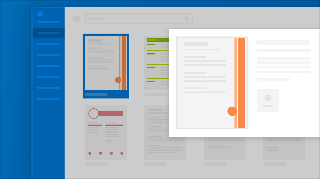
illustrating how to choose a custom resume template in Microsoft Word
Client:
Microsoft, Windows
Role:
Visual Designer
Challenge:
Create a series of Microsoft Ninja-cat holiday desktop wallpaper for download from Microsoft Store. Our small team of illustrators was tasked with creating uniquely themed wallpaper which required Microsoft’s Ninja cat in epic landscapes and scenarios.
Solution:
I drew up some quick ideas then jumped into illustrator to create 3 uniquely themed ninja cat desktop wallpapers. This project was super fun and collaborative.
Ninja cat going off road
Ninja cat snow snowmobiling around Mt Rainier
A fun illustration of ninja cat ice fishing
Our Holiday themed wallpaper featured for download on Microsoft Store
Client:
Microsoft
Role:
Illustrator
Challenge:
Create illustration assets for various Microsoft groups including Rewards, Tips, and other Microsoft groups.
Solution:
I brainstormed, sketched and created original vector illustrations adhering to the brand guidelines, translating ideas into detailed illustrations.
Created for Microsoft AMC Rewards program
Digital badges created for Windows Insider Bug Bash
Created for Microsoft Rewards, still hero image created for hand off to animation
Conceptual exploration for Microsoft Rewards page
Microsoft Rewards page with final animations incorporated
Illustration explorations; softer color palette
When time permits, I love the challenge of creating vector based illustrations from existing references. Here are two examples that show the process from monoline to full color rending. Both were created using Adobe Illustrator.
Vector Illustration: Sony A7iii - Monoline
Vector Illustration: Sony A7iii - Color
Vector Illustration: Mando - Monoline
Vector Illustration: Mando - Color
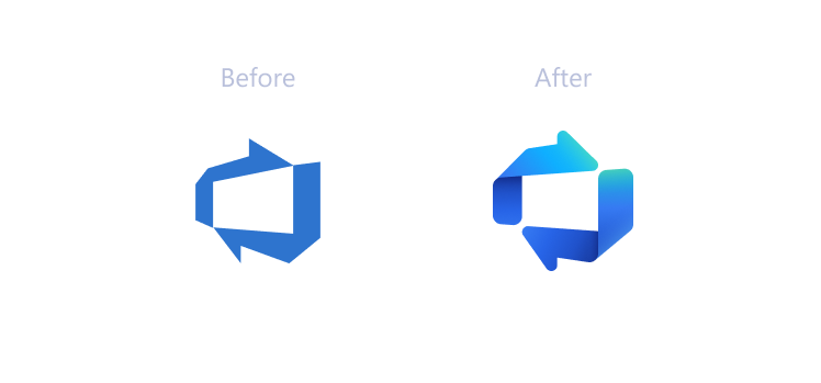
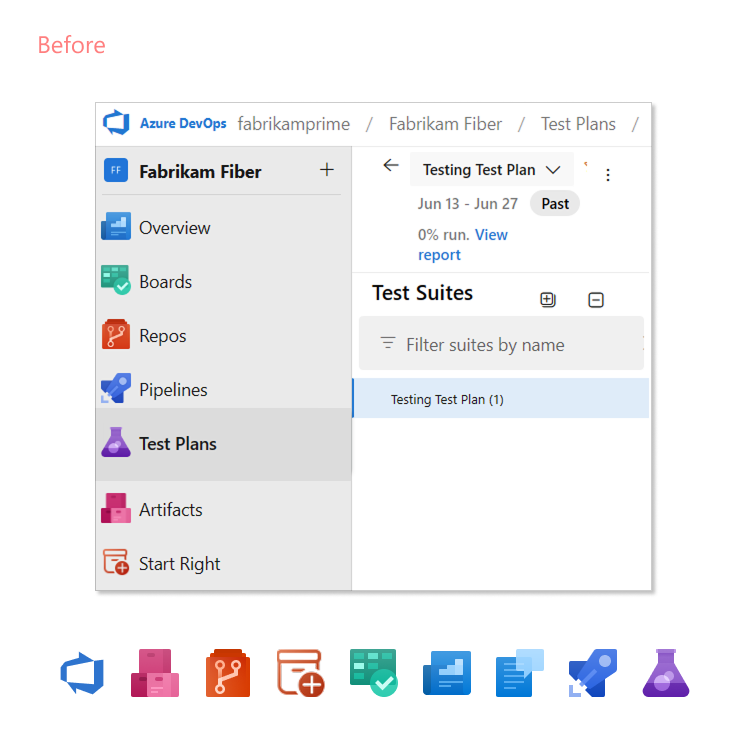
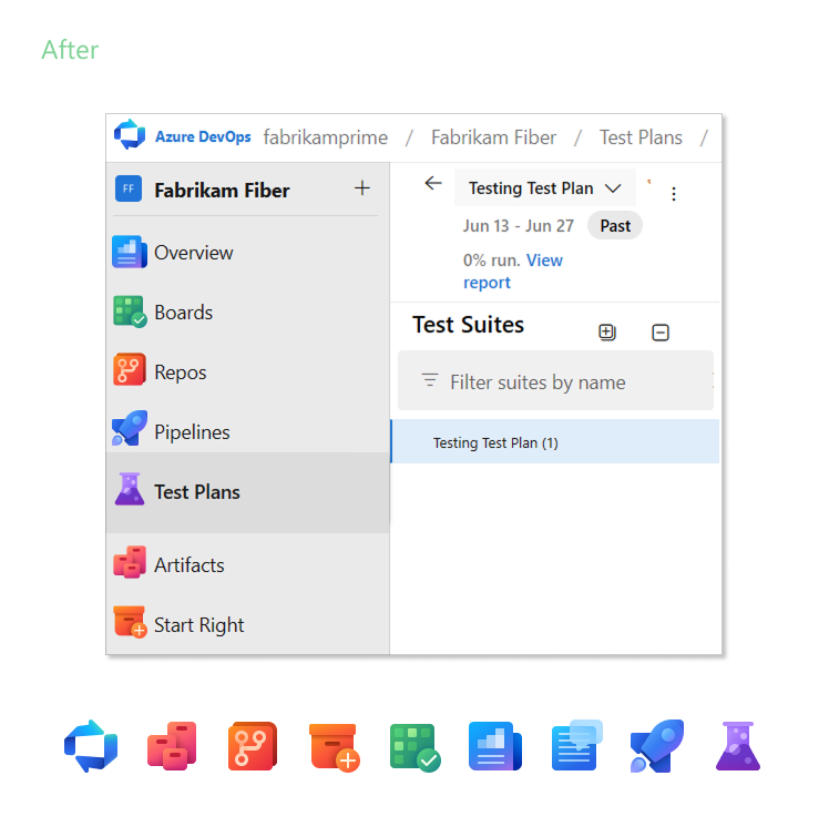
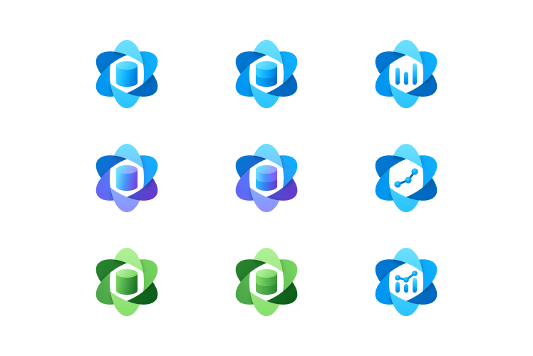
Azure DevOps product icon ‘before’ & ‘after’
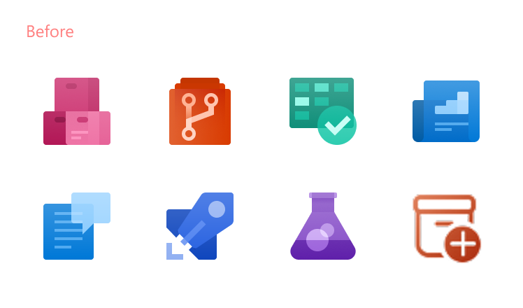
Original navigation icons.